Case Study

World-Class Design for Enterprise
OneDAM is the essential engine behind Apple media giants including TV+, Music, and Marketing. Despite its importance, the platform had become a collection of competing design languages and third-party frameworks. This fragmentation created significant design debt, resulting in inconsistent user patterns and increased engineering overhead.
Role
- Lead UX Designer
Duration
- 1½ years
Project Scope
- Research
- System Design
- Design Language
- Enterprise Workflows
- Information Architecture
- Interaction Design
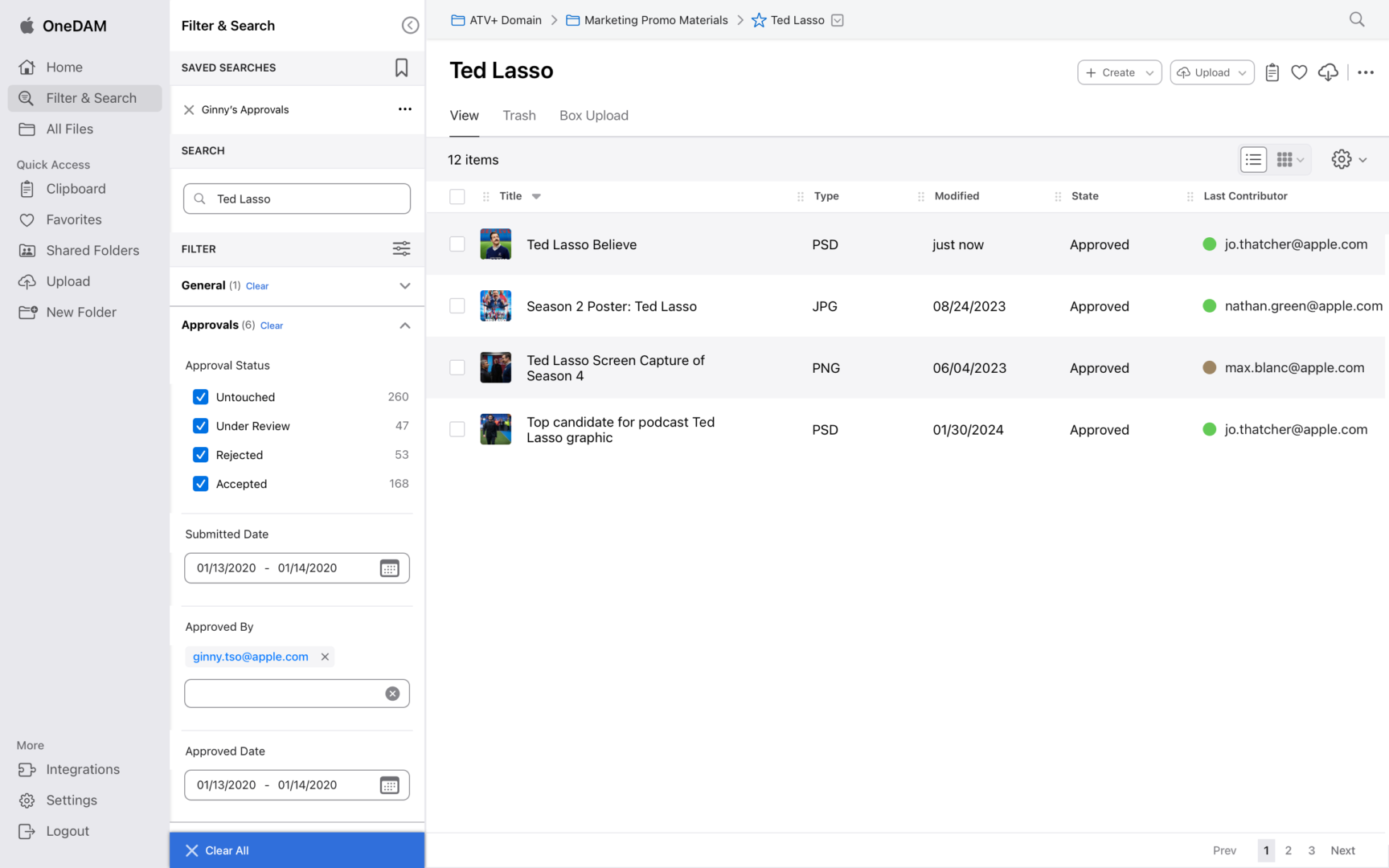
Search and Filter
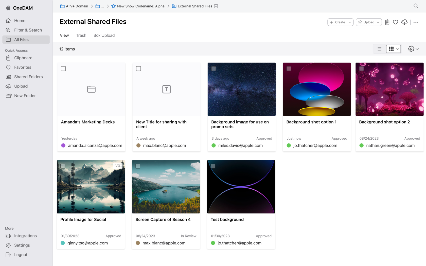
Shared Files Grid View
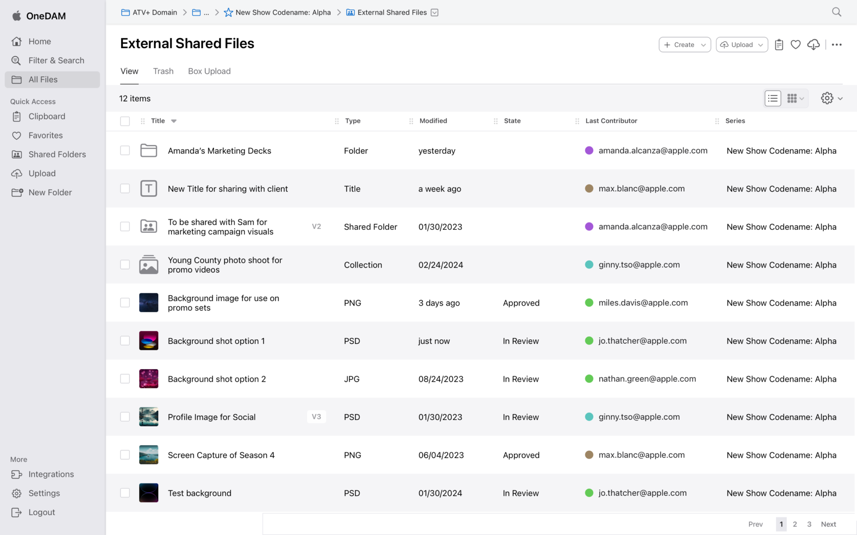
Shared Files List View
Scaling Consistency for Apple’s Internal Ecosystem
Operating as the UX owner in an agile, sprint-based environment, I couldn’t stop the ship for a total rebuild. I adopted a dual-track strategy:
- Systemic Foundation: I architected Cornerstone as a scalable design system to bring Apple HIG standards to the enterprise and serve as the platform’s foundation for quality.
- Tactical Execution: I simultaneously redesigned high-impact flows like Batch Upload to provide immediate utility while stress-testing the emerging system components.
Tracks of Work:
Filter & Search
Personalized Dashboard

Tracks of Work:
Cornerstone Design Library
As OneDAM scaled across teams and product areas, inconsistencies in patterns, behaviors, and visual language became a growing source of friction—for both users and product teams. Similar problems were being solved in different ways, slowing delivery and making the experience feel fragmented.
To address this, I established the Cornerstone design library to serve as the platform’s shared foundation. The goal was not to create a static system, but a practical, evolving set of patterns that teams could rely on as they designed and built new features.
Establishing a Shared Foundation
I began by auditing existing screens and components to identify overlap, gaps, and inconsistencies. From there, I defined a core set of components and interaction patterns that reflected real usage across the product, rather than idealized or theoretical use cases.
Each element in the library was grounded in production needs:
- Designed to solve recurring problems teams were already facing
- Flexible enough to support multiple workflows and contexts
- Clear in purpose, behavior, and constraints
This approach helped teams adopt the library naturally, without forcing a large upfront shift in how they worked.

Typography Audit Imagery
Color, Iconography, and Visual Logic
Color and icon usage for the system had evolved organically over time, leading to ambiguity and inconsistent meaning. I introduced clearer rules for how color and iconography were applied, focusing on clarity, accessibility, and predictability.
Rather than prescribing rigid usage, I defined visual logic: guidelines that explained why a color or icon should be used, not just when. This made it easier for designers and engineers to make good decisions as new scenarios emerged.

Color Palette: Minimizing the Blues
I inherited a library with over 250 disparate color styles: 73 of which were blue. To simplify, I audited and consolidated these into a semantic palette of 8 core blues. I then engineered a status matrix using transparent white and black overlays to create a language for tints and shades. This logic ensures the system is natively compatible with both Light and Dark modes while maintaining AA accessibility. This eliminated the need for designers to manually select hex codes for different themes.

Cornerstone color palette

Status Color Strategy Applied to Banner Components
Icon Strategy: Standardizing Spatial Logic
Apple provides a proprietary set of iconography known as SF Symbols.
-
Style Consistency: Should we use line art or solid variants?
-
Scaling Rules: When should we employ simpler variants for small sizes?
-
Container Logic: What are the rules for using icons within circles or squares versus stand-alone?
-
Componentization: How do we handle icon overlays, such as adding or removing assets?
-
System Integration: What naming convention will work with Sketch’s specific instance replacement logic?
-
Workflow: How can we build a practical color workflow that remains consistent across the library?
- Naming Convention: What pattern should be utilized to name icons to create a system that’s both practical and meaningful for designers and engineers?
DLS Icons
Icon Strategy
Solving for Size & Weight Inconsistencies
Harnessing SF Symbols presented a technical challenge. The symbols come in multiple weights and sizes, but they are not bound by a standard height or width box. When converted to vector artwork, icons can vary from 70% to 150% of their original font size.
Additionally, Sketch does not allow typography sizes to be scaled within components. Creating a unique component for every possible size and weight combination was an unsustainable solution.
The Solution: The Bounding Box Framework
I developed a system of four specific type styles that equalize the size and weight of the icon artwork. By placing the font artwork inside a standardized, invisible bounding box and then outlining it into vector artwork, I created a library of beautiful, scalable, and consistent icons. This framework allows the team to swap icons without manually adjusting alignment or scale every time.

Icon weight strategy
DLS Icons

card components
Patterns That Scale With the Product
Beyond individual components, I focused on higher-level patterns—things like layout structure, spacing, and interaction behaviors that shape how the product feels as a whole.
By documenting these patterns alongside real examples, I helped teams:
-
Move faster without re-deciding basic structure
-
Maintain consistency across unrelated features
-
Design new flows that felt immediately familiar to users
Over time, these patterns reduced fragmentation and made the product easier to extend.

Cornerstone card sets

Tracks of Work:
Upload & Add Metadata
Uploading files and adding metadata is a core action in any DAM system, but the existing flow in OneDAM was slow, disjointed, and error-prone. Users had to enter metadata one file at a time, with limited guidance or feedback, which made batch actions difficult and frustrating. This created a significant UX gap in a platform where users needed to ingest large volumes of content and add metadata quickly and efficiently.
Technical Limitations Drive UX
Because of the third-party framework the tool was built upon, we had a unique challenge to work around: When a user begins uploading files, the browser window must stay open until the files are completely finished uploading. This goes against common interaction models and patterns that many users find instinctual.
In order to successfully complete the process they started, we struggled to work with this limitation in an elegant way. It drove many of my design decisions for how we created the flow and presented it to the user.
Utilizing an informational banner helped inform the user of the upload progress and need to stay on the page, but there was still creativity needed to address the limitation.

Upload & Add Metadata Flow

Upload
Upload: Empty Asset Drawer

Upload: New Files Added

Upload: File with Duplicate

Upload: Bulk Add Metadata
Metadata Logic Matrix
One of the biggest obstacles was understanding how different asset types and tenant data affected metadata requirements. To bring clarity to this, I developed a Metadata Logic Matrix — a consolidated reference outlining mandatory fields, optional attributes, and dependency rules across contexts. This became a foundational artifact that ensured the interface could dynamically adjust required inputs based on file type and tenant configuration.
Asset List Item Evolution
As uploads succeeded, the way assets appeared in the list was critical for users to understand what had happened and what still needed attention. I iterated several list designs to balance informational density with legibility:
-
Added thumbnails — based on frequent user requests — to improve visual scanability.
-
Moved error messages into individual list items to make problems easier to act on.
-
Refined layout to incorporate metadata status icons and actions without overwhelming the user.
The final pattern became a reusable component that improved clarity across the app, not just in upload contexts.

Asset Card Specs


